

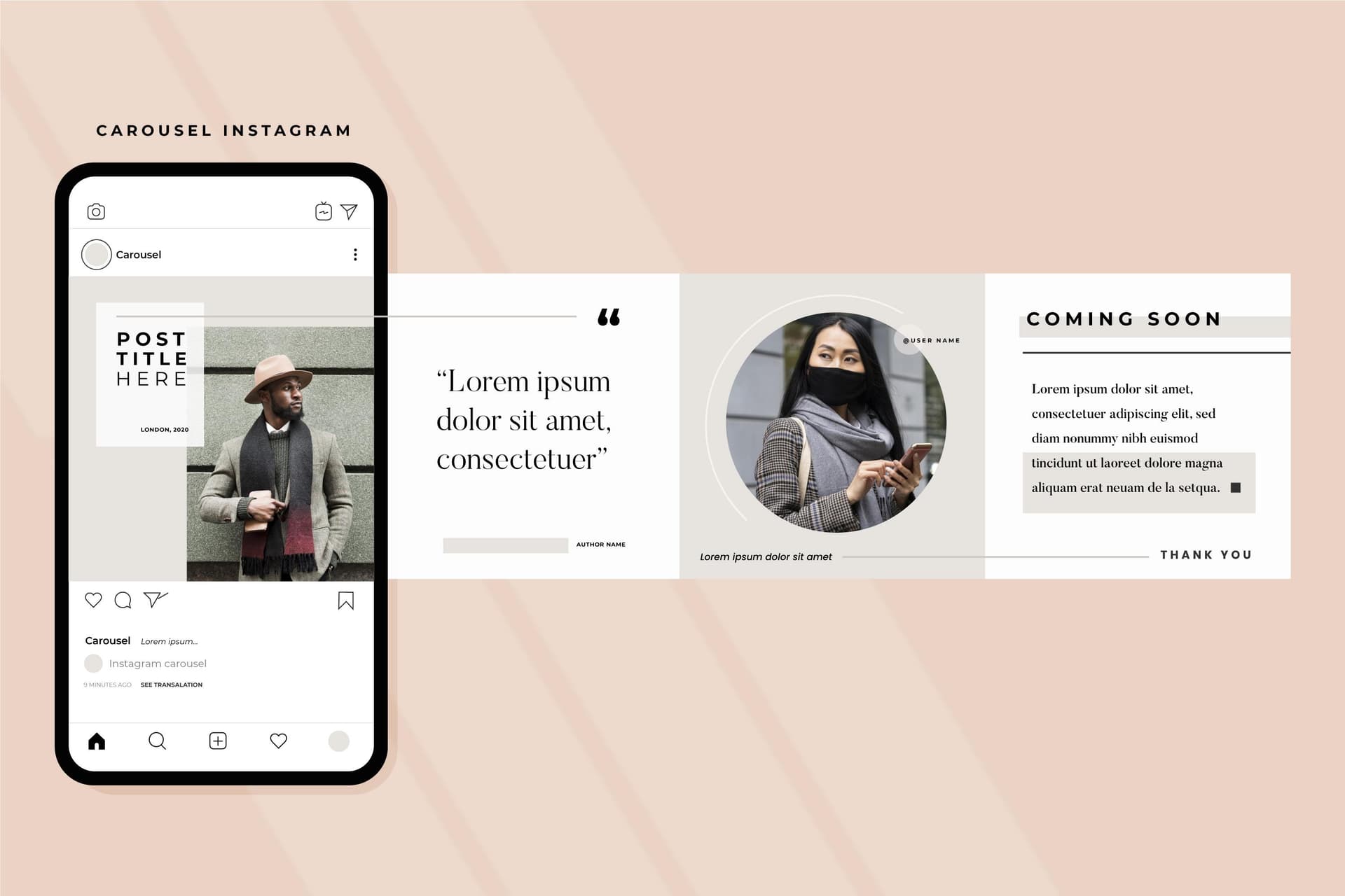
A seamless Instagram carousel is not only a sliced panorama. It is any multi-slide post that feels like one piece of content while someone swipes — same visual language, continuous story, no awkward jumps.
That is the format that earns dwell time. Instagram rewards posts people finish. A carousel that feels seamless is built for finishing.
Most accounts that want this outcome do not need to design one giant wide image. They need a proper Instagram carousel maker: correct slide size, consistent branding, a swipe-worthy structure, and clean exports. Panoramic photo splits are a narrower technique covered later.
Two kinds of “seamless” (pick the right one)
| Type | What it is | Best tool |
|---|---|---|
| Design-seamless carousel | Separate slides that share colors, type, layout rhythm, and a continuous narrative | Instagram Carousel Maker |
| Panorama-seamless carousel | One wide photo/artwork cut into tiles that line up edge-to-edge | Design the master, then split (optional free splitter) |
| Profile puzzle / grid | Images that form a bigger picture on your profile grid, not in the feed swipe | Grid planning + split workflow |
If you are making tips, stories, product education, launches, or personal-brand posts, you want design-seamless. That is the main path below.
Why design-seamless carousels outperform random slide dumps
A feed swipe fails when:
- Slide 1 looks finished (no reason to continue)
- Slide 2 suddenly uses a different background or font
- Text density jumps wildly
- The story restarts every slide instead of continuing
A design-seamless carousel fixes that with:
- One hook on slide 1
- One visual system (palette, fonts, margins, logo placement)
- One arc (problem → points → payoff → CTA)
- One export size for every slide
That is exactly what an Instagram-focused carousel editor is for.
Exact sizes (lock these before you design)
Instagram forces every carousel slide to match the aspect ratio of the first image.
Recommended export sizes
- Portrait (default choice): 1080 × 1350 px (4:5)
- Square: 1080 × 1080 px (1:1)
- Landscape: 1080 × 566 px (rarely ideal for carousels)
Keep critical text and faces inside a safe margin (~60 px from edges). For full dimension detail, see the Instagram carousel size & aspect ratio guide.
When you create slides in CarouselMaker’s Instagram carousel maker, export at Instagram feed size so you are not resizing by hand in the app.
The swipe structure that feels seamless
Use this spine for almost every non-panorama carousel:
| Slide | Job | Notes |
|---|---|---|
| 1 | Hook | Incomplete promise, bold claim, or curiosity gap. Must earn the swipe. |
| 2 | Context | Why this matters / who it is for |
| 3–N | Value | One idea per slide. Same layout rhythm. |
| Last − 1 | Summary or proof | Recap, result, or example |
| Last | CTA | Comment prompt, save cue, follow, or link-in-bio |
Slide 1 rules
- One idea only
- Largest type in the set
- Visual continuation cue helps (edge fade, “1/8”, partial list, arrow language)
- Do not put the full answer on slide 1
Middle-slide rules
- Repeat header style and margins
- Keep body text length similar slide to slide
- Number steps when the content is sequential
- Avoid introducing a new color system mid-set
Final-slide rules
- Clear next step
- Brand mark or handle in a consistent corner
- No new dense teaching on the last slide
Step-by-step: build a seamless carousel in Instagram Carousel Maker
This is the primary workflow for creators, founders, coaches, and brands.
Step 1 — Start from a topic, text, or URL
Open the Instagram carousel maker / AI carousel generator and choose how you want to start:
- Topic — e.g. “5 hooks for fitness carousels”
- Text — paste a newsletter section, script, or outline
- URL — turn a blog post into swipeable slides
AI drafts a full slide structure so you are not staring at empty canvases.
Step 2 — Choose Instagram feed format
Select Instagram Feed sizing (prefer 4:5 / 1080×1350). Every slide should export at the same dimensions. That single decision prevents the “slide 2 got cropped differently” problem.
Step 3 — Lock brand basics once
Before rewriting copy, set:
- Color palette
- Font pairing
- Logo / profile image / handle
- Background style
Consistency is what makes the swipe feel seamless. If slide 3 invents a new look, the set falls apart even if the writing is good.
Step 4 — Edit for swipe flow (not for essay length)
Go slide by slide:
- Strengthen the hook
- Cut any slide that repeats the previous one
- Keep one idea per slide
- Move proof and examples to the middle
- Write a specific CTA on the last slide
If you need hooks fast, the free carousel hook generator is useful before or during drafting.
Step 5 — Check the “seamless” QA list
Preview the full set and ask:
- Could someone understand the promise from slide 1 alone?
- Do colors and fonts match on every slide?
- Are margins and title positions stable?
- Does each swipe add something new?
- Is the CTA only on the final slide (or clearly secondary earlier)?
- Are all slides the same pixel size?
Step 6 — Download and post in order
- Download the Instagram feed images
- In Instagram, create a new multi-image post
- Select slide 1 first (locks aspect ratio)
- Add the remaining slides in order
- Write the caption (hook line + save prompt works well)
- Publish
More on posting mechanics: how to post a carousel on Instagram.
Practical carousel examples (design-seamless)
Example A — Educational “mistakes” set (8 slides)
- 1: “7 Instagram carousel mistakes killing your reach”
- 2: Why carousels get a second look in the feed
- 3–7: One mistake + fix per slide
- 8: “Save this before your next post” + handle
Build it in the Instagram carousel maker from the topic line above; then tighten the hook and CTA.
Example B — Product story (6 slides)
- 1: Partial product + bold outcome claim
- 2: Who it is for
- 3–4: Features as benefits
- 5: Social proof or before/after
- 6: Offer + how to buy
Keep the product photo treatment and background identical so the set feels branded, not collage-y.
Example C — Personal brand narrative (7 slides)
- 1: “I almost quit in month 4. Here’s what changed.”
- 2–6: Timeline beats with one lesson each
- 7: Soft CTA (“Follow for the build-in-public version”)
Same type scale and accent color on every slide = seamless even though each slide is a new scene.
Example D — Launch sequence (5 slides)
- 1: Date + teaser visual
- 2: Problem
- 3: Solution snapshot
- 4: What’s included
- 5: CTA
Pair the feed carousel with profile planning in the Instagram feed planner if the launch also needs a clean grid.
Optional path: true panoramic seamless (photo strip)
Use this only when the content is one continuous image — a skyline, product lineup photo, renovation wide shot, or campaign illustration.
- Design or export a master canvas
- 3 portrait slides → 3240 × 1350
- 4 portrait slides → 4320 × 1350
- Keep faces, logos, and words off the vertical cut lines
- Split the master into equal full-height tiles
- Upload left → right with identical dimensions and no extra margins
If you already have the wide file and only need precise cuts, CarouselMaker’s free Instagram image splitter (Carousel mode, margins off) handles the slice-and-download step.
Important: panoramic splits are great for visual moments. They are a poor default for teaching, lists, and most brand content. Those belong in the carousel maker workflow above.
Common mistakes (and fixes)
Slides feel like unrelated posts
Fix: one palette, one type system, repeating title bar, shared background treatment in the Instagram carousel maker.
Nobody swipes past slide 1
Fix: incomplete hook, curiosity gap, or a numbered promise (“7 fixes — swipe”). Do not resolve the whole idea on the cover.
Text looks different after upload
Fix: export all slides at the same Instagram size before upload; select slide 1 first.
White lines on panoramic splits
Fix: identical tile sizes, no margins, re-split from one master.
Too much text per slide
Fix: one idea per slide; move detail to the caption or a follow-up carousel.
Brand missing until the last slide
Fix: small consistent handle/logo placement from slide 1 or 2 without crowding the hook.
How often should you post seamless-style carousels?
A simple mix that works for most accounts:
- Design-seamless educational or story carousel (made in the carousel maker) — 2–4× per week
- Occasional panoramic visual carousel — launches, product strips, big photos
- Reels / singles — for reach variety
Carousels win saves and shares when the swipe is worth finishing. Frequency matters less than finish rate.
Workflow for teams
- Brief the outcome: teach, sell, story, or panoramic visual
- Draft structure in the AI carousel generator
- Brand in the Instagram carousel maker
- QA hook → flow → CTA → identical export sizes
- Publish in order on Instagram
- Optional: check profile impact in the feed planner
- Only if needed: panoramic split via the image splitter
Quick start (default path)
- Go to the Instagram carousel maker
- Generate from a topic, text, or URL
- Set Instagram feed size (4:5)
- Lock brand colors and fonts
- Tighten hook + CTA
- Download and post in order
Seamless is a feeling first: one system, one story, one swipe path. Build that in the carousel maker. Reach for panoramic splitting only when the artwork itself is the message.